Authorized administrators can view, configure, copy, and edit forms and their questions.
After you set up the main form details, you need to configure the questions that appear in the form.
Questionnaires are highly configurable. For example, you can insert instructions at the top of the form, as well as within groups of questions.
Note the following about configuring forms and questions:
You can Save your questionnaire at any time.
Note: When setting up a new form, if Active is selected in the template, saving the form makes it available to users, even if you have not yet configured the questionnaire.
When editing an existing form's questionnaire, the changes you make are not available to users until you click Publish.
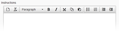
You can format the instructions you include in the form. Options include applying bold or italic typeface, creating lists, indenting text, and more.
The Report Label field allows you to provide abbreviated question text to be used in notifications and reports.
Question Structure
The forms service offers a wide variety of options so that you can create and implement the exact information-gathering form you need.
Structure
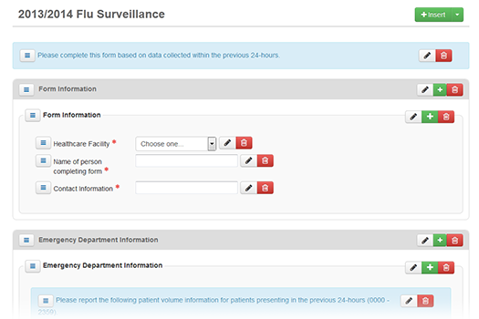
Building a form consists of creating a structure or hierarchy. For example, you can add a group that contains a number of fields. The advantage is that you can give that group a name and then add questions appropriate to that area. For example, you could add a group called Form Information and add questions related to the individual completing the form.
You have a number of options when building your form and questions. For example:
- You can add instructions to the top level of the form, as well as to a group and a field set (set of questions).
- You can add sets of questions to a group or a table.
- You have two options for including a list of values from which the user can choose. You can use an existing list of standard options, such as states or counties, or build a list from scratch.
- When you create a list, you can specify the default value that appears to the user for that field or question.
Questionnaire
Building the form's questionnaire consists of creating a structure or hierarchy. For example, you can add a group that contains a number of fields. You provide the group with a name and then add questions appropriate to that area. For example, you could add a group called Demographics and add questions related to a patient's age and gender.Options include the following:
- You can add instructions to the top level of the form, as well as to a group and a set of questions.
- You can add sets of questions to a group or a table.
- You have two options for including a list of values from which the user can choose. You can use an existing list of standard options, such as states, days of the week, or hospital resources. You can also build a list from scratch.
- For most types of questions, you can specify the default value that appears to the user for that question.
- While creating or editing a form questionnaire, you can preview how it will appear to your users.
Note: If you want to change the title of the form, you must do that in the template fields. You cannot do that from within the questionnaire.
Question Types and Options
Read the following sections to learn about building question elements, including actions, instructions, groups, tables, and more.
Actions
The following features and options are available when you are building the questionnaire:
Icon or Option | Description |
|---|---|
| Insert into the form an instruction or a container to hold fields and questions. This is the top level of the questionnaire hierarchy. Instructions added at this level appear at the top of the form. |
| Edit the instruction, group, table, set of fields, or question. |
| Add an instruction, group, table, set of fields, or question. |
| Remove the instruction, group, table, set of fields, or question. If you remove an item, you also remove any items it contains. The system asks you to confirm each deletion. |
| Re-order the items in a group, table, or set of questions. Click the icon next to the item you want to move and drag it to its new location in the list, table, or form. |
| Save additions and changes to the form. If you are working with a form that has already been published, this saves a draft of the revised form. You must publish it to make the new version available to users. |
| Preview the form as the user would see it. You can then return to the form and make and save additional changes or publish it. |
| Save changes and publish the form. While you are editing an existing form, the unchanged version is still the one available to users. To make this new version available, you must publish it. |
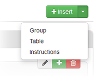


Instructions
To help the user complete the form, you can add one or more sets of instructions. When you add instructions from the Insert menu, they appear at the top level of the form hierarchy. You can also add them to components within the form, such as groups and sets of fields. These instructions appear with that component. This allows you to add instructions at virtually any level to provide your users with as much help as needed.
The order icon  lets you specify where in the form or component the instructions appear.
You can also format the instructions. Options include applying bold or italic typeface, creating lists, indenting text, and more. You can also quickly clear all formatting.
Groups
You can add groups to the form, which allows you to organize the information into meaningful sections. If appropriate, you can provide a name for the group.
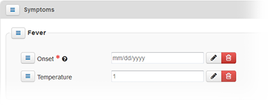
You can add instructions that relate to the specific group and add sets of fields and tables to the group.
Tables
Some information is best displayed in tabular format. You can quickly and easily build a table in your form. In addition, you can specify the type of data each column accepts.
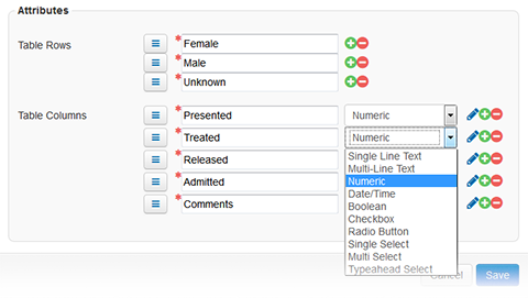
If you select a type that requires additional configuration, you can click the edit icon to access those tasks. In addition, use the order icon to change the order of rows and columns. Refer also to Type-specific Options for details.
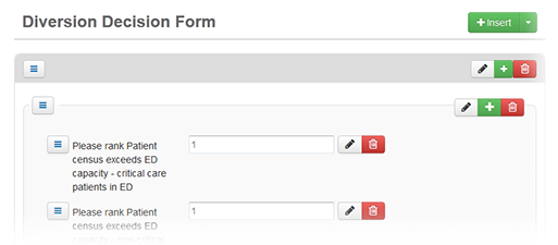
Sets of Fields
Common
The following table lists and describes fields that are common to most or all types of questions.
Attribute or Component | Description |
|---|---|
Attribute | |
Label | Text of the question that appears to the individual filling out the form. |
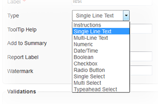
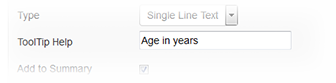
Type | Specify the type of field you want to add to the questionnaire. Depending on the type you select, additional fields may appear in the form configuration page. For example, if you specify Numeric, you also specify the type of number the user can enter for this question.
Refer also to Type-specific Options. |
ToolTip Help | Specify a brief description, definition, or instruction for the associated field.
If you specify text, the Help icon |
Add to Summary | Select to specify that the question and answer are to appear in the form's notification summary. When the form is completed and submitted, this summary appears to the recipient in the Completed Forms notification window. Tip: In some cases, you may want the form summary to include a question, but only when the answer is Yes. Set up a check box question in the form and add only the Yes option to it. If the user completing the form selects Yes (as well as the Add to Summary check box), the question appears in the form summary. If the user does not select Yes, the questions does not appear in the summary. |
Report Label | Abbreviated version of the question to appear in text notifications and reports. |
Validations | |
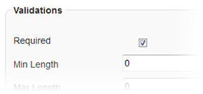
Required | When selected, the user completing the form must provide an answer to this question before they can submit the form. The asterisk icon (*) appears next to the field, as does the word "Required."
Available for the following types: Text, Numeric, Date, Text Area, Selection List, Table Row and Column |
Default | |
Default Value | You can specify the choice or content that should appear to the user by default in the question's answer area. |

Type-specific Options
The following table lists and describes the fields you can configure. The fields available depend on the question type you select.
Type | Description and Fields |
|---|---|
Single Line Text | Answer can consist of a single line of text. Min Length, Max Length - In the Validations section, you can specify the minimum and maximum lengths of the answer. |
Multi-Line Text | Answer can consist of multiple lines of text Min Length, Max Length - In the Validations section, you can specify the minimum and maximum lengths of the answer. |
Numeric | Answer must be numeric and comply with the other attributes specified. Numeric Type - Choose the type of numeric character: number, percentage, or currency. Decimal Places - Specify the number of decimal places allowed in the number. Min Value, Max Value - In the Validations section, you can specify the minimum (lowest) value in the range and the maximum (highest) value in the range. |
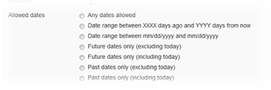
Date/Time | Answer must be a date, time, or date and time combination that complies with the other attributes specified. Date Type - Specify the type of date: date, time, or date and time. Allowed dates - If you specify an option that includes the date, in the Validations section you can select the option to apply the appropriate restriction to the types of dates entered.
|
Each of the types below offers the same options: using a standard list or building the list of choices from scratch. | |
Checkbox | Answer options from which the user can choose are presented as check boxes. The user can select more than one. |
Radio Button | Answer options from which the user can choose are presented as radio buttons. The user can select one option. |
Single Select | Answer options from which the user can choose are presented in a drop-down list from which the user can select one option. |
Multi Select | Answer options from which the user can choose are presented in a list box from which the user can choose one or multiple options. Use Standard List / List to Use - List of options presented to the user comes from a standard list stored in the system, such as Yes/No, days of the week, months of the year, US states, hospital resource, or all resources. Choices - Template designer creates the options presented to the user and specifies the order in which they are presented. |